Coverage you can actually act on
11 Jul 2026
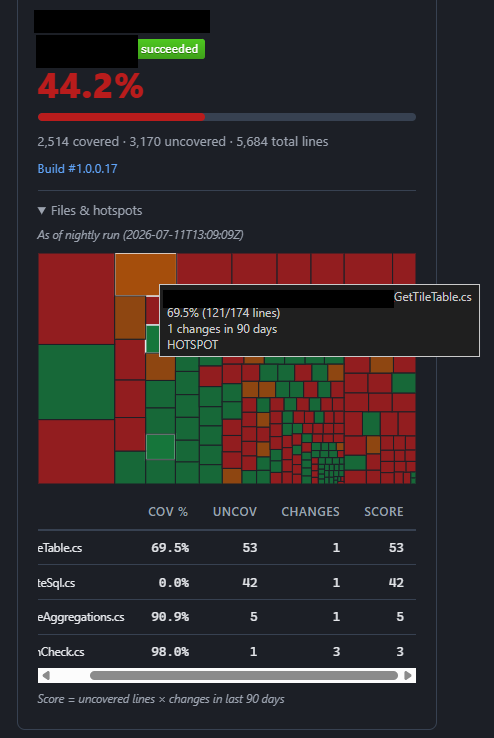
Our PR & Coverage Dashboard (now v2) just learned three new tricks, all aimed at one question: where should testing effort go next for that service?
Trends. Every nightly run now snapshots each pipeline's coverage into a history file. Tiles show a sparkline of the last 30 days plus a delta against yesterday, so a slow slide from 58% to 51% is visible long before anyone would think to ask.
Heat maps. Each build already publishes a Cobertura coverage artifact; we now download it, merge the per-file line data, and render it as a treemap - every rectangle a file, sized by lines of code, coloured red-to-green by coverage. One glance shows exactly where the untested mass lives. Click a file and it opens in Azure DevOps.
Hotspots. Coverage alone doesn't equal risk. We cross-reference each file's uncovered lines with how often it changed in the last 90 days: uncovered × churn. Files that are both poorly tested and frequently touched float to the top-10 - the highest-value testing targets in the codebase.
Best of all, it's honest: when a pipeline's artifact doesn't reconcile with its build summary, the dashboard says so rather than showing pretty-but-wrong numbers.
Each build also reports the status of the last build, one less potential screen to look at during standups.
Things I realised here:
Trends. Every nightly run now snapshots each pipeline's coverage into a history file. Tiles show a sparkline of the last 30 days plus a delta against yesterday, so a slow slide from 58% to 51% is visible long before anyone would think to ask.
Heat maps. Each build already publishes a Cobertura coverage artifact; we now download it, merge the per-file line data, and render it as a treemap - every rectangle a file, sized by lines of code, coloured red-to-green by coverage. One glance shows exactly where the untested mass lives. Click a file and it opens in Azure DevOps.
Hotspots. Coverage alone doesn't equal risk. We cross-reference each file's uncovered lines with how often it changed in the last 90 days: uncovered × churn. Files that are both poorly tested and frequently touched float to the top-10 - the highest-value testing targets in the codebase.
Best of all, it's honest: when a pipeline's artifact doesn't reconcile with its build summary, the dashboard says so rather than showing pretty-but-wrong numbers.
Each build also reports the status of the last build, one less potential screen to look at during standups.
Things I realised here:
- This highlighted that some of our pipelines had no code coverage to begin with... and as each pipeline has it's own code coverage report; it seemed unlikely that people pay much attention to it. Now it's front and centre each standup when looking at open pull requests and the unit test adequacy scored against them. See previous post.
- There are some false positives in this first cut as database migration files get counted among the stats! As such these will be excluded in future to make the representation more accurate around the files we care about.
- This is obviously a shift left effort... Integration and E2E tests are still as important as ever. More so with AI making a lot of the low level changes.

Justin Holsgrove
Senior Test Engineer/ QA Manager
He/Him
🤖 Test automator, engineer and QA Manager
✒️ testtechie.co.uk -> testtechie9.wordpress.com
🙆♂️ jholsgrove.github.io
Open To
Meet at MoTaCon 2027

Rosie Sherry
Very cool to see the updates on this :)
Sign in
to comment

There are countless ways to show up and contribute. Which one will you try today?
Explore MoT

Learn how to structure and organize test management data as an AI-ready foundation that gives AI systems richer context for testing insights and workflows.

Unleash the power of generative AI to boost your software testing and day-to-day tech tasks

Debrief the week in Quality via a community radio show hosted by Simon Tomes and members of the community
