
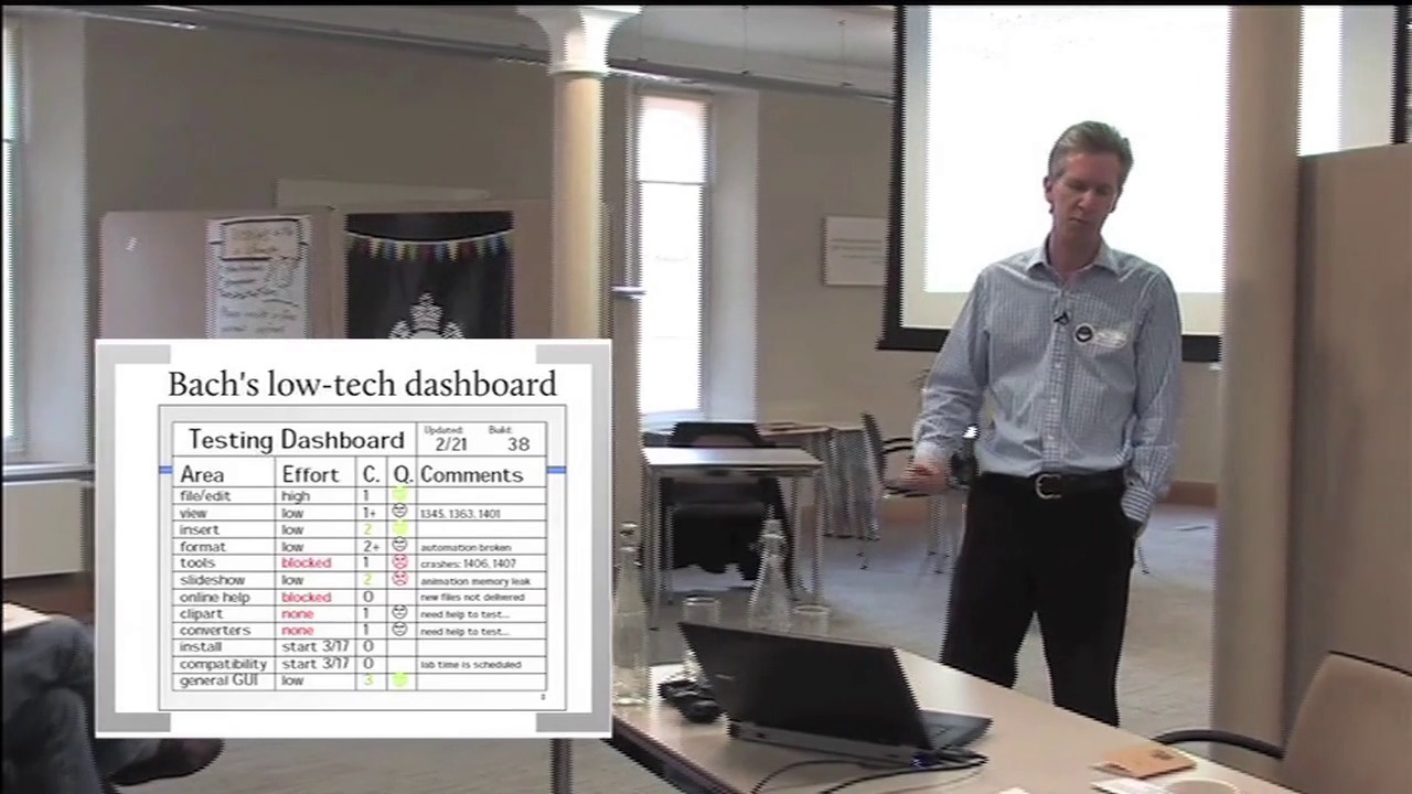

We think we know what we mean when we talk about quality. We try to assess it, improve it, safeguard it. To do so we devise ways to measure it, or at least to measure approximations and indicators of it. We try to quantify quality, so we resort to quantitative measures of qualitative goals.
I have a nagging concern that we have drifted too far from the thing we originally found valuable, and are busy counting in currencies that have lost most of their true value.
I am looking for new ways to visualise quality. I want to find ways for stakeholders to be able to intuitively discern good quality from bad quality, for teams to quickly detect when they are improving or degrading it, and for testers to easily highlight the good and bad areas of our products.
This is not a presentation as such, but rather an informal sharing and exploration of ideas that are currently simmering in my head.




Comments