Everyday accessibility: 7 ways to do a little a11y every day
Modernise your design strategy with mobile-first and keyboard-centric approaches that create more resilient, accessible, and user-friendly software.
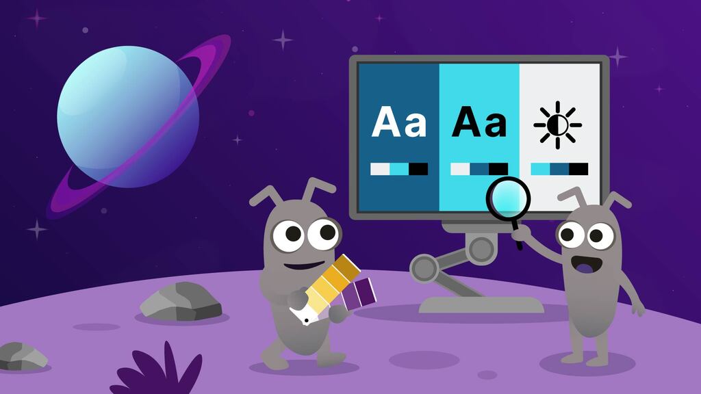
Image ALT Text: An illustrative scene set in space with a ringed planet in the background. Two cartoon alien bugs are working at a computer terminal on a purple landscape. The screen shows "Aa" text icons and brightness symbols, representing digital accessibility. One alien bug is selecting colors from a fan deck, and the other is examining the screen with a magnifying glass.
Digital accessibility, or a11y, means that as many people as possible can use and interact with the web or application using whichever method they choose. But it doesn't happen without the intention of development teams. This article will help you focus on that intention.
Since disability can manifest in many areas of life, so too do accessibility needs. At a minimum, we aim to ensure that our site works for those who cannot see or hear, those who cannot use a mouse, or those who need specialised assistive technology, such as a Braille keyboard, to interact with the web.
Anne-Marie Bonneau, known as the 'zero waste chef,' said about waste: 'We don’t need a handful of people doing zero waste perfectly. We need millions of people doing it imperfectly.' We need to apply this thinking to digital accessibility testing. As I said in my 2022 article, Simple tests for accessibility every tester should know, we need software testers to make a little progress towards access for all people, every day.
Take small steps toward accessibility, because if you look for perfection, it may keep you from acting at all. The simple tests I wrote about in 2022 are practical methods that can be learned and applied quickly. In a similar vein, this article will outline some actions that you can apply as soon as you finish reading, within reason, of course. The list is part of a presentation we created, which we have shared at meetups and a few companies.
Create user journeys for all the types of journeys
User journeys are similar to user stories, but they are more focused on higher-level paths through the software rather than specific actions. They are an effective way to share across teams the intent of the software and how it should be used.
We can make our user journeys more accessibility-focused in a couple of ways. For example, it is important to include a variety of audio and keyboard journeys. Journeys are usually focused on the typical user, someone who can see and use a mouse. But there are other types of journeys, like audio journeys for those using screen readers, or keyboard navigation journeys for those who cannot use a mouse or an alternative input device, such as a switch.
Those journeys are subtly different from the standard path in several ways:
- The user of a screen reader might need additional information announced to ensure they have all the necessary information to complete the task.
- A keyboard user needs to be able to complete all required actions. Keyboard accessibility is foundational to digital accessibility and should be a priority for all teams.
Which brings us to number 2.
Develop inclusive user personas, not just the usual ones
A persona, a user persona, or a testing persona, is defined in the glossary by Hanisha Arora as
“A fictional character that represents a typical user group of your product. They are built, where possible, using real data about your users’ demographics, behaviour, goals, and pain points. Think of them as a quick way to step into your users’ shoes when testing.”
An inclusive user persona is an accessibility-focused extension of a persona. They can have a range of diverse needs, abilities, or lived experiences. Those variations could be physical, cognitive, or even sensory. These personas are useful on a number of levels, not just for testing. Using them can aid in ideas, designs, and development. Some of the ways they help are:
- Highlighting potential bias in ideas, designs, and development
- Promoting inclusion and empathy through focusing on needs and behaviours, which in turn can bring to light unseen gaps
- Making context visible by highlighting specific barriers
When they are based on real data and people, and when they consider permanent, temporary, and situational exclusions, inclusive user personas can offer much richer insights than traditional personas.
Advocate for mobile-first design
Focusing on mobile application use first can also help accessibility in ways that might surprise you. Let’s dive in.
- Core content. By starting with a smaller screen, you focus on presenting the most important information first. That, in turn, makes life easier by offering quick and clear information, which is particularly helpful for screen reader users and those with various cognitive needs.
- Straightforward navigation. With a focus on minimal clutter, simple and intuitive paths, and clear headings, it is useful for everyone, and it is vital to some users.
- Responsive design. By definition, if you design for mobile, you have to make it responsive: to different-sized screens and for portrait and landscape use. You build in responsiveness, just like you build in accessibility.
- Control spacing. Designing for fingers on a screen first ensures you have a decent target size as well as well-spaced buttons and controls. This is so that the user does not unintentionally cause an application action by a random touch on the screen.
By overcoming mobile design challenges first, software tends to be more resilient and have an accessible core that scales. This makes for a more inclusive digital experience for a wider audience.
Take the #NoMouse challenge: try using your desktop without a mouse
The #NoMouse Challenge is a project of the DO-IT Centre at the University of Washington. It is a global effort to raise awareness about accessible web design.
I’d not actually heard of the challenge when I started experimenting with using only my keyboard once a week. I just called it 'accessibility Tuesday.' On each Tuesday, I’d put my mouse in my drawer and do all the things I would normally do: work, testing, anything really. I was fortunate to have been trained as a typist to help me run a dispatch department, where typing up the delivery notes was part of my duties. It has turned out to be one of the most useful skills I acquired before I became a software tester in my late 30’s.
You can learn so much about your software and systems simply by not using a mouse. I mentioned previously that keyboard accessibility is foundational to digital accessibility, and I can’t stress this enough. So many aspects of accessibility rely on a solid keyboard foundation. Here are a few of the main ones to think about.
- Logical tab order. Tabbing through a system or web page logically and systematically, without getting trapped anywhere, supports many other types of assistive technology.
- Visible focus indicator. It sounds obvious, but you should be able to see where you are on the screen you are interacting with.
- Standard key function. Ensuring you follow the established functions, such as using the Enter or Return key to activate or submit. Using the space bar to check a box, or the even more obvious Esc (escape) to close a modal dialog box.
Test for issues with colour contrast between text and background
As I highlighted in my article of July 2025, The 6 most common digital accessibility bugs and how to fix them, low-contrast text is the most commonly found accessibility failure on the web. A whopping 79.1 percent of home pages do not have sufficient colour contrast between text and background, according to the WebAIM million report. See the link in the references for more information.
Sadly, more often than not, development teams and acceptance testers don't examine contrast. The typical practice is to look at the UI in an office or home with good lighting and a decent-sized screen, and of course, then it ‘always’ looks fine. But the fact is that many tools offer you the ability to measure the actual color contrast ratio of your application's user interface against the Web Content Accessibility Guidelines (WCAG) standards (usually 4.5:1 for normal text, 3:1 for large text). Fixing problems is even simpler. Quite often, the contrast between text and background needs just a little bit of boosting, especially if it's brand-colour-related.
Remember to check for text alternatives
Text alternatives, generally called alt-text or alternate text, should be assigned to images that convey information.
Before we go any further, let me clarify a common misunderstanding about this. Time and again, I’ve heard folks say something along the lines of 'all images need text.' This is not true. Not even close to true. The vast majority of images online are decorative and add nothing important or vital to the information being conveyed.
So, think of it this way. Images need a reason to have alt-text added. Here are some examples:
A line chart showing a trend
- The alt-text would summarise the takeaway from the chart, such as the direction of the trend, key points about it, or the magnitude of variation. If all that information is clear and available in the body of the text, the alt-text might not be required.
Photo of a person performing an action
- The alt-text might need to convey the person's identity, demeanour, outfit, context, setting, and so on. Again, if it is a generic person in an office, it might not be required.
Infographic with mixed text and icons
- With the rise of artificial intelligence tools that can create infographics, they seem to be everywhere. The alt-text would describe the call to action or conclusion it is making. Any critical text or information is shown.
Maps or route directions
- The alt-text would need to explain the spatial relationship being displayed and any associated direction. Other useful things could include the common name for the area, highlighted locations, and their relationships (for example, 5 miles northeast of X is Y). And, of course, the map's primary purpose should be included as well. The qualifier again is whether all that information is available in the body text.
Screenshots showing captured states
- The states could be error states, bugs, instructions, and so on. The alt-text should explain the visible problem, any explicit text important to the message being conveyed, and its impacts.
As with many areas of digital accessibility, people worry they will get alternate text wrong or make the situation worse in some way. Doing alt-text imperfectly is better than not doing it at all. The Royal National Institute of Blind People, or RNIB, offers great advice on how to do this, and the link to the article will be in the references. Here is their simple list they expand on in their article.
- Be descriptive
- Keep it concise
- Use keywords
- Contextualise
- Avoid redundancy
- Use punctuation sparingly
Make time for screen reader testing sessions
Simply put, a screen reader (SR) is software that reads the screen. But there’s more to it than that. In addition to the text, the screen reader announces structural elements, controls, states, focus changes, and dynamic messages. It is a very different experience from the standard journey that relies on sufficient eyesight.
Here are a few examples of what an SR would say, to offer a flavour of what to expect.
- The top of the Ministry of Testing’s website features a menu across the top, including Learn, Events, Trends, and more. As you tab along them with an SR active, you would hear 'Link, learn. Link, events. Link, trends.' The SR announces both the element, that it is a link, and the text displayed.
- On a mobile phone, you do not see that list. Instead, you see three lines indicating a menu. Navigate to it, and you will hear, ‘toggle navigation, button, collapsed. Double-tap to expand.’ If you did double-tap, it would announce, ‘toggle navigation, expanded.’ In both cases, you are hearing what you have navigated to, its current state, and in the first case, what to do next to access it.
- If we navigate to the last item, which is the Pro link, the SR would add ‘list end’ to indicate that there are no more items. If we double-tap to navigate to the Pro page. We hear, ‘Pro, (the page we are on), visited link, (because I’ve been there before), Where quality professionals grow their careers,’ (the first text on the page).
As you can see, three very simple actions provide us with a wealth of information. People who don't need SRs would barely acknowledge these visual elements as they click or tap to get where we are going.
I highly recommend trying a few SR sessions to get a flavour of what that world feels and sounds like. It can give you a completely different insight into how software can be used and possibly build some empathy for those who have to use SRs in ways that are rarely considered priorities for teams.
Here are my top tips for conducting your first screen reader session.
Find out how to turn it off and on.
- Mobile users take heed: don’t get stuck on a train with everyone looking at you because your phone is shouting at you. And in your panic, 10 minutes of phone shouting go by before you remember that you can simply turn the volume down. Yes, that was me.
- Phone shortcuts are generally very straightforward to identify for your device. I have an iPhone as my main device. A triple-press of the power button brings up the accessibility menu, where I can turn on and off a number of tools, including the SR.
Find a navigation cheat sheet for your device or platform and tool combination.
- Try to find a printed one. Most folks know how to tab forward and back, but most do not know how that translates to a phone or tablet. I won’t hide the ball: you swipe left to right to tab forward, and right to left to move back. There is an array of keyboard and gestures you can use. Two-, three-, and four-finger gestures mean different things, so a cheat sheet is a must.
Start with a slow announcement speed.
- Screen readers' announcement speed can be slowed down or sped up. Experienced SR users can listen to it speak at an average of 300 to 500 words per minute. Expert users can move up to 700 words a minute. Beginners should start slow, and don’t worry about needing to go back a few times to hear what has been said until you get more comfortable. For me, it really was like learning another language. Being able to process the different elements of what was being said meant I could move on to testing if it was right.
Use shorter, focused sessions to begin with
- I can offer advice only on my own experience, but in the beginning, 10 or 15 minutes was more than enough for me. It took me a week or so to stop playing with it, for want of a better term, and get focused. I treated those sessions like an exploratory testing season, setting myself goals and writing charters. I’d decide on the task I wanted to complete and read up on any shortcuts or actions I’d need to complete. Then my sessions became more valuable, my use more natural and quicker.
- I would never suggest that I replicate exactly the experience of a user who requires an SR. But I learned enough to identify when something wasn’t right, like missing or incorrect information. This is how I could suggest one small accessibility improvement at a time.
To wrap up
I’d like to thank Scott Kenyon for helping pull this information together for presenting to meetups and companies. We have delivered this presentation a number of times, and we tell stories like those included in this article.
Digital accessibility can seem scary, but it is not an exact science. It's possible to improve something for one group while making it worse for another. The main point is to keep trying and learning. With the European Accessibility Act in force as of 2025, digital accessibility should be a priority for teams. You can get ahead by doing a little a11y every day.
What do YOU think?
Got comments or thoughts? Share them in the comments box below. If you like, use the ideas below as starting points for reflection and discussion.
Questions to discuss
- How difficult would it be for you to add some or all of these everyday a11y ideas into your daily or weekly routines?
- Have you ever completed a screen reader session? What was it like? Or, what are you potentially worried about?
- Who might have the authority to decide if an image is decorative or not?
- How could you involve your team or share this information with them?
Actions to take
- Review an existing persona to make it more inclusive, or create an inclusive persona for your team.
- Add three small accessibility checks to your daily routine.
- What task, meeting, or ceremony would be best to bring up accessibility as a discussion point?
- Where can you add alt-text, low-contrast, and mobile-first considerations into your existing processes?
For more information
- Usability Testing Guide & Benefits, Laveena Ramchandani
- 30 Days of Accessibility Testing, Rosie Sherry
- The DO-IT Center: University of Washington
- The University of Washington Accessible Technology website includes a variety of helpful step-by-step guides on how to create accessible digital content
- WebAIM Million report
- How can I write alt text? RNIB (Royal National Institute of Blind People)
- Understanding the European Accessibility Act (EAA), TetraLogical blog

STEC and SQEC Certified. MoT Ambassador, writer, speaker, accessibility advocate. Consulting, Leeds Chapter Lead. MoT Certs curator. Testing wisdom, friendly, songs and poems. Great minds think differently

I'm the program lead in software testing apprenticeships for the BPP education Group. international speaker, accessibility, communication & neurodiversity advocate & co-run MoT Leeds meetup
Comments