What risks are there with launching a website like this?
16 Sep 2025
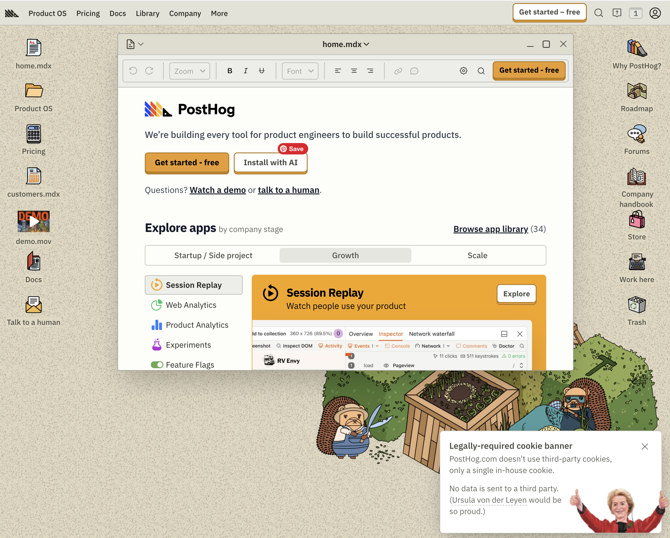
I spotted Posthog's new website via an update from Cory Watlio on LinkedIn, the person behind the redesign.
You can feel the sense of excitement embedded with an audacious flavoured fear of the unknown.
It's beautiful, but is it practical?
People may love it, but will they use it?
It's certainly caught people's attention.
And I love it. On the face of it, it is impractical. Where do we go to find what we need? What will happen when I go here?
Whatever it is, I salute the efforts. I love to see it.
In a world of bland, where every app and service look familiar, websites like this are rare.
It's easy to point out the flaws, but what if it sticks.
What if they start introducing friends like Bug, SpaceDuck or SpaceSeagull across their website, just like we have done across the MoTaverse?
What if it helped people pay more attention to the culture behind company. What if it introduced more visual ways and cues to help people find what they needed.
Or what if we recognised that sometimes it's simply ok to have a bit of fun. And that fun adds a new dimension that helps us see the wider picture differently.
Quality can be how it makes you feel.
I like how the new Posthog website makes me feel. It makes me feel like they care. And is that not quality too?
In the spirit of "quality", what are the positives and risks about the new PostHog website?
Go have a play: https://posthog.com/
Cory's post on LinkedIn: https://www.linkedin.com/feed/update/urn:li:activity:7371593864803028992/

Rosie Sherry
CEO & Founder at Ministry of Testing
She/Her
I've been working in the software testing and quality engineering space since the year 2000 whilst also combining it with my love for education and community. It turns out quality, community and education go nicely hand in hand.
🎓 MoT-STEC qualified
Sign in
to comment
Manage your entire QA lifecycle in one place. Sync Jira, automate scripts, and use AI to accelerate your testing.
Explore MoT

Fri, 19 Jun
A half-day educational experience to navigate the world of AI
Boost your career in software testing with the MoT Software Testing Essentials Certificate. Learn essential skills, from basic testing techniques to advanced risk analysis, crafted by industry experts.
Debrief the week in Quality via a community radio show hosted by Simon Tomes and members of the community
