
How I built a PR dashboard that flags risky pull requests
02 Jul 2026

During stand ups we have a PR dashboard which is a list of open PRs, who is assigned and whether it is in a state of approval or not, as well as listing a bunch of draft PRs no one really cares about until they are published for real. So I set claude to work to give me something better.
The tasks:
List the following:
The tasks:
List the following:
- Open PRs
- The repo it lives in
- The author
- The reviewer with review state
- How many tests were added
- How many lines of code were touched
- How many files were touched
- Flag red amber or green large PRs with not many tests added (Threshold: green ≥ 2 tests / 100 product lines)
Claude eventually produced a lightweight front end that communicates to Azure Dev Ops via a Personal Access Token.
The RAG section is just an indicator not to be taken as gospel but it gives the team pause for thought at stand ups for particularly large changes or changes with weak unit test coverage. It rebuilds a unified diff locally for the relevant file types (.cs, .ts, .feature) and counts three things from the added lines: test attributes added in test files ([Test], [Fact], [TestCase], [TestMethod], [Theory]), Gherkin Scenario: lines added in .feature files, and product lines added in non-test .cs/.ts files.
It's not an exact science but it is more useful than the initial list we were using.

Justin Holsgrove
Senior Test Engineer/ QA Manager
He/Him
🤖 Test automator, engineer and QA Manager
✒️ testtechie.co.uk -> testtechie9.wordpress.com
🙆♂️ jholsgrove.github.io
Open To
Meet at MoTaCon 2026

Rosie Sherry
What you say about 'it's not an exact science' is important.
Critics of AI will often point how and where it is wrong, but if it's better than what existed before, then that is progress.

Justin Holsgrove
I will likely make tweaks to it and iterate as needed as I get feedback

Simon Tomes
This is excellent, Justin. I hope it inspires others to experiment with something similar. I like the concept of providing information that gathers a team and helps them make decisions.
While I have no knowledge of the context, I wonder if there's an opportunity to introduce some humour into the dashboard – if appropriate. What that would look like? Emojis? Occasional meme? Or perhaps some random quotes that comments on the various scenarios of data? Little bug characters?

Leonid Khudisman
Hi Justin,
The PR dashboard is great for team visibility and trend tracking. Consider pairing it with a pre-commit hook as the first line of defense as well. The hook catches issues for developer locally, before anything hits GitHub. The hook gives you immediate feedback, the app gives you the historical picture.

Aj Wilson
Progress over Perfection for the win! This is a great example of using data to drive better engineering conversations rather than just reporting status. The RAG indicator is a useful prompt for discussion, and I like that it focuses attention on risk, test coverage, and review effort without pretending to be a perfect quality metric. Thank you for sharing.
Sign in
to comment
Take this 7-question assessment to see where your QA team stands and get a plan for what to automate next.
Explore MoT
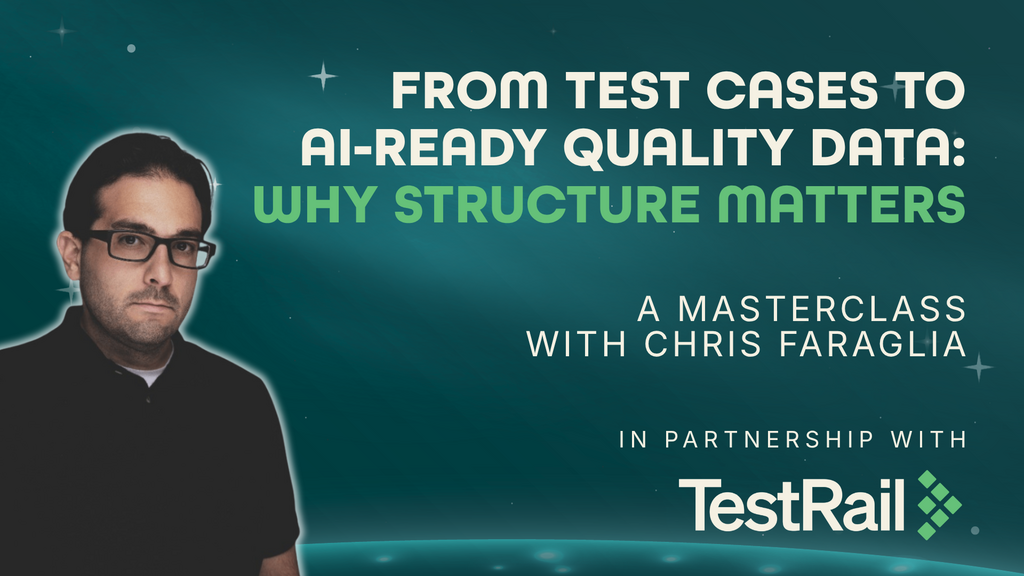
Learn how to structure and organize test management data as an AI-ready foundation that gives AI systems richer context for testing insights and workflows.

Turn AI curiosity into engineering confidence.
Into the MoTaverse is a podcast by Ministry of Testing, hosted by Rosie Sherry, exploring the people, insights, and systems shaping quality in modern software teams.
