How we overhauled the MoTaverse profile page
Using the GPS Model to deliver software with quality and care
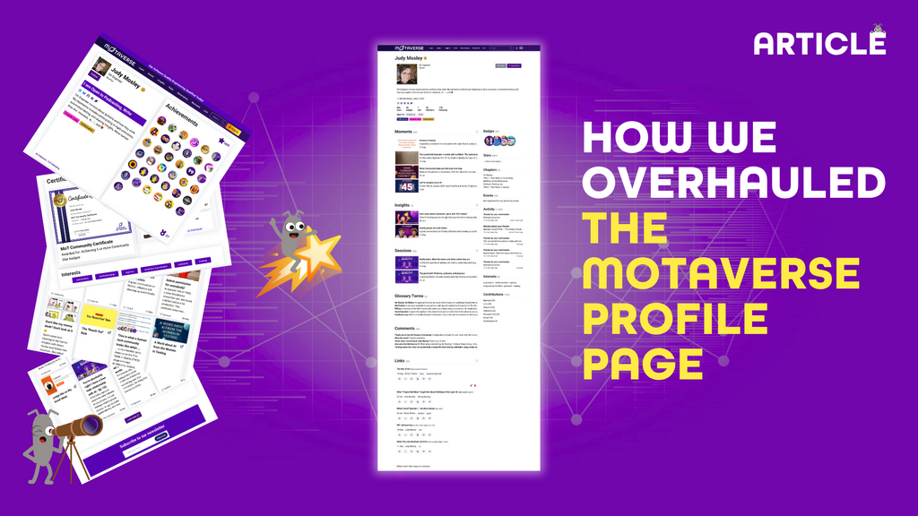
Updating the MoTaverse profile page was no straightforward task. It had to cater for multiple data points and several use cases. The goal was a complete overhaul to help members look awesome and offer ways to inspire contribution. This was to be achieved either through the member looking at their own profile or looking at someone else's profile.
Member profile pages are the core of the MoTaverse and in my capacity as communty lead turned product lead I decided to give it more attention and care than we do with other features.
We took the following route to release:
- Bubbling up the desire to change
- Whole-team session review
- Pair design session
- Design clarification session
- Async dev change checks
- Exploratory testing session 1
- Pair debrief 1
- Invite ambassadors for feedback
- Exploratory testing session 2
- Pair debrief 2
- Invite beta testers for feedback
- Wrap in feedback
- Async dev change checks
- Final team check and release
1. Bubbling up the desire to change
Rosie Sherry and I had talked about updating the profile page for a while. We felt the existing one at the time was a bit shouty. It had lots of colour given the emphasis on displaying every single badge. It also gave equal weight to every contribution type. There was a point where Rosie was sharing her profile with someone only to realise that the only contributions on display were glossary entries and nothing else. While glossary items matter, it missed the point of highlighting all the other things she'd been up to. It just displayed the latest contributions.
Scanning profile pages of members with little or no activity also felt like a missed opportunity. Why would someone want to share their profile with someone else if they haven't been up to much? There are plenty of super active members who aren't able to properly showcase who they are, what they've been up to and what they've achieved. We were also motivated by bits of community feedback, internal chats on our Slack, off the cuff comments on calls and more. It all added up.
Something had to be done.
2. Whole-team session review
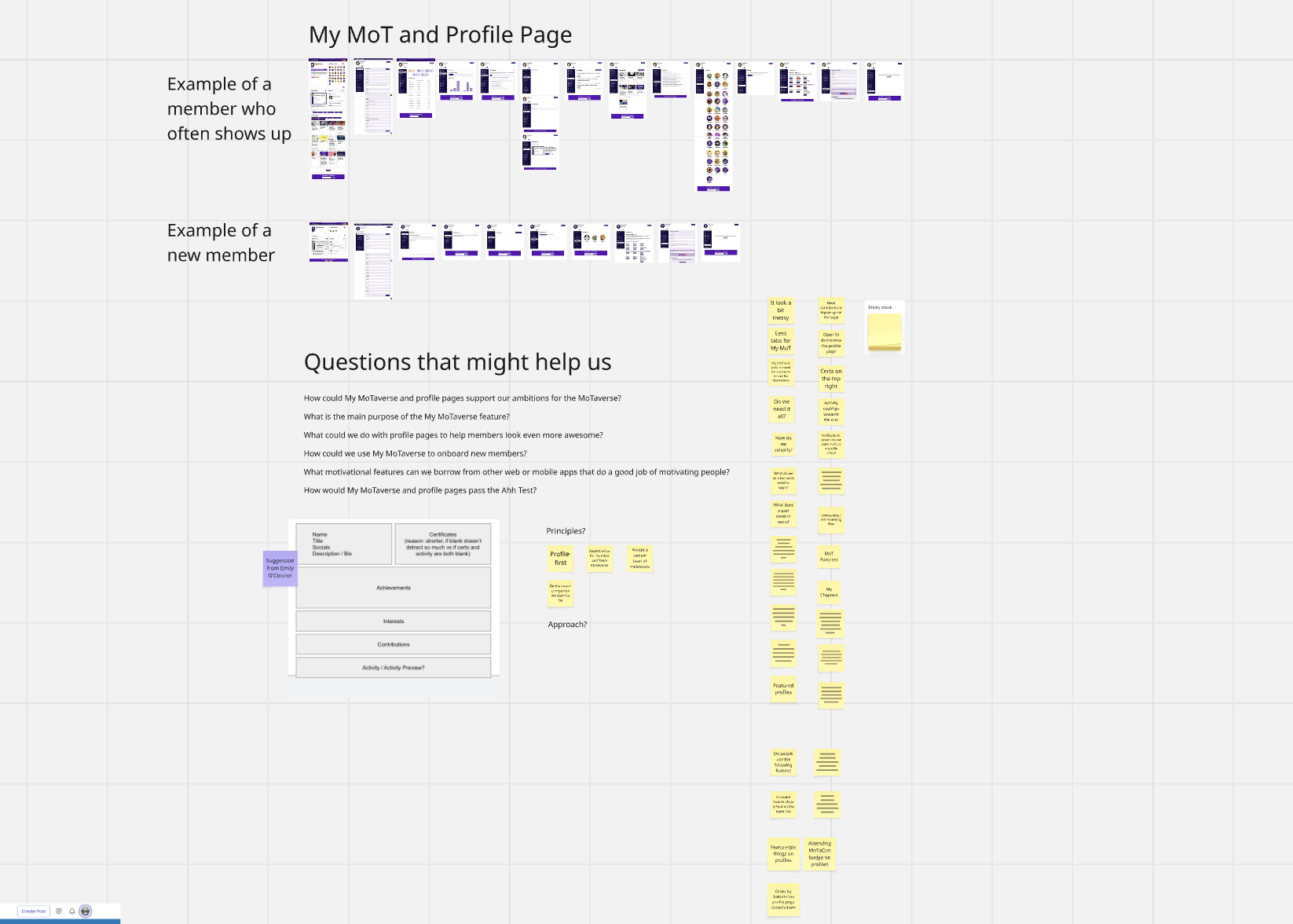
Prior to running a session with the entire MoTaverse team, less Sarah Deery, who is on maternity leave, I added screenshots of the now old profile pages to a Miro board. The board had a series of questions to prompt us. We explored the goals of a profile page and how it joins up to everything else in the MoTaverse. Then captured lots of ideas of what it could look like.
Looking back on my notes, we also had screenshots of My MoT to review. It became apparent that while we could update My MoT because of its connection to profile pages, we decided that that was a lower priority to overhauling the profile page. A future version of the profile page will include fields that could be updated instead of having to navigate to My MoT to do it.
Everyone chipped in and shared their thoughts. We got a real sense of where we could take the profile page and why it mattered. Our desire was to have the profile page support the career companion claim we make about the MoTaverse. We were guided by the principle that it should have instant value for every member and Team MoTaverse. Seeing who someone is and what they've been up to makes it easier to decide who to collaborate with.
3. Pair design session
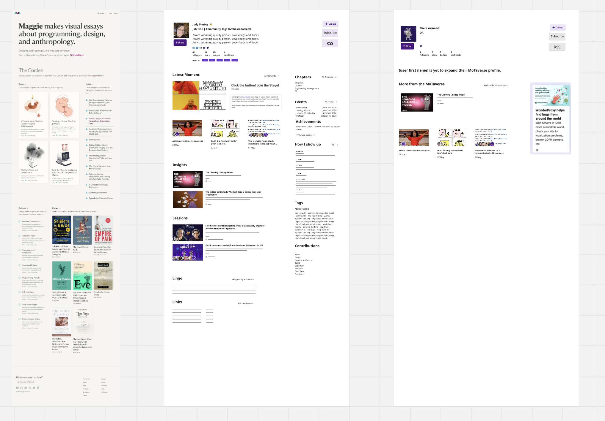
Rosie and I later joined a call for a pair design session. Our goal was to mock up a full of data new look profile page. We could then work on what the profile page would look like when someone is just getting started. We researched well designed and engaging blog templates and the blogs we like. We had in mind that familiarity helps folks see the value in something. We asked ourselves whether we could emphasis Moments (MoTaverse speak for blog posts) as a way to encourage people to show up and express themselves in text, images, video and more. We fed our research into Claude – which gave us a few ideas – but decided to mock things up ourselves in Miro.
We were onto something.
4. Design clarification session
With some good-enough mockups, I led a session with Rosie and Andrew Morton. Andrew's our lead developer/engineer and all round implement-all-the-things legend! He was up for the challenge. He asked tonnes of questions to clarify the design, just to make sure he understood the direction of the page overhaul. Not only that, his questions revealed many unknowns, and help the three of us explore ideas to make sure new scenarios were covered – to make sure we could cover data in a certain state. ‘What about this?' and ’What happens when?' were staples of the group call.
It became apparent that we should first update the profile card. This is the bit at the top of a profile page. It has the profile name, image, description etc. It appears across the site in different contexts such at the end of Moments, on Sessions (talks) and more. We agreed a way forward. Gemini listened to the call and took notes so we could easily come back to the detail of the requirements.
What's interesting here is that we had no need to write down the requirements. The conversation was the requirement and Gemini had it all written down. Very nice indeed! No time wasted writing pesky user stories and countless acceptance criteria. In my product role it felt like we'd passed The Ahh Test.
5. Async dev change checks
I'm skipping over the details of Andrew's detailed implementation and the tests he runs as it's actually a closed box process. I didn't really need to know the details of the models, classes and tests he'd implemented. I just wanted to see the outcome of his excellent efforts. Maybe Andrew could talk about this in another article or Moment, but that's for another time.
The async checks would look like this: Andrew would post the changes he'd implemented on a dedicated Slack channel. I'd run a quick check and share rapid feedback. Often a “looks good to me” was enough. And while you might baulk at the lack of detail, it actually helped us move fast. I knew at some point soon I'd be running at least a couple of detailed exploratory testing charters/sessions when the page was close to taking its full shape.
It's a fine balance, right? How much deep testing do we do to satisfy the desire to shift-left and reveal problems, questions, ideas and praise sooner rather than later? At this stage I'd made a conscious choice to light check and not deep test.
6. Exploratory testing session 1
Andrew continued to do his thing as the main frame of the page took shape, he worked on filling out the data in each section. It was cool to see it form this way. I had a sense of “well this is looking cool”. He'd continued to ask how we should deal with mobile view challenges and we came up with a simple solution to wrap the right hand section under the main section. If you take a look at a profile page on a desktop and switch it to a mobile view you'll see what I mean.
Andrew had asked for mobile mockups yet I just wasn't able to get around to it. However, with those constraints in mind, Andrew worked out a good way forward. This is another example of working within constraints, making decisions and moving forward without overthinking things. We knew we had to make progress and aim to get this in front of some people other than ourselves ASAP.
But wait, I had to run a detailed exploratory testing session before any of that. How come? I just knew I had to think like an active member and see what they might make of a full and beautiful looking profile page. I used the The Exploratory Testing Charter Planner (ETCP) to spin up a charter. Great to make proper use this Claude skill I'd built.
Have a look at the actual outcome – there's the planning bit and the testing notes. Charter: Explore the beta portfolio page using a desktop web browser to discover helpful observations about its functionality
I felt great after running it, it generated lots of thoughts, clarified some assumptions and helped shape my views on the direction we were going. Such is the power of 45 minutes of deep and focused exploring!
Was time for a debrief call.
7. Pair debrief 1
I jumped on a call with Andrew and I took him though the notes I'd written during the exploratory testing session. We discussed every item and agreed:
- What needed investigation
- What needed changing
- What could be ignored
Andrew, again, demonstrated good question asking skills. Things were calm and straightforward and we both left the meeting with a sense of momentum. It was around this time we decided to share a special beta link with our ambassadors.
8. Invite ambassadors for feedback
Should we just let the ambassadors explore or should we set expectations about our ambitions for the new profile page and outstanding work? I went with the latter, thinking that the information I shared would act as an oracle for the ambassadors. At least they'd have some idea of what we'd like to achieve with the overhaul and also not waste their time asking questions about features that were still to be built.
It was still not possible to share everything and every decision – and this is an important point. If anything, I didn't want to bias the ambassadors too much. We were keen for their instant reaction and feedback. That's what mattered at this stage. Questions and feedback came in and I made an effort to respond to every piece of feedback. I'd often repeat myself in different ways but that was just part of riding out the feedback process. Changes were happening fast at this stage so in some cases the feedback became redundant.
Thanks to ambassadors Rahul Parwal, Jesse Berkeley, Judy Mosley, Ady Stokes and Petros Plakogiannis for sharing feedback. Select their names to see their fancy new look profile pages!
9. Exploratory testing session 2
I knew I had more things to explore after the first exploratory testing session because I'd ran out of time. But I do like a timebox for a good reason. We have to stop and debrief. And as you can see from earlier it was better to debrief ASAP than run more sessions and feel overwhelmed with lots of discoveries, questions and things to discuss. There's also that risk of things changing and becoming no longer relevant if we stick ourselves into lots of detailed testing sessions before lifting our heads up to speak with someone else. This is why I love a timebox.
I ran Charter: Explore the bottom half of the right hand side section of the profile page on a web browser to finish capturing initial thoughts. I had in mind recent changes which Andrew had rapidly incorporated since our first debrief, so I wrapped them into this exploratory testing session. As soon as I finished, it was time to book in another pair debrief.
10. Pair debrief 2
Andrew and I ran through the charter discoveries and discussed them, agreed on changes. All good.
We also decided to discuss the biggest gap in our requirements so far: what to do about members who have just created a profile or have not been active? Rosie and I had briefly touched on this in our pair design session, yet it was still unclear. So for the next 30 minutes Andrew and I explored countless ideas before landing on three key concepts:
- Present information to help someone get started — for the person viewing their own profile and someone else's
- Make use of the homepage content to fill up the profile
- Only remove the homepage content once someone has done something within the main section
It was a good feeling. And Gemini took notes for both of us to refer to for actions to take and changes to make.
11. Invite beta testers for feedback
I posted an invite to our dedicated beta Slack channel. I decided to set expectations by answering the following questions:
- What's a profile page?
- Why bother changing the existing profile page?
- How do I get access?
- What do you want me to do?
- How can I share feedback?
- Do I get a star for sharing feedback?
It was important to acknowledge every item of feedback and share gratitude for the effort folks made to explore and share. I think the process worked well and for those who did share feedback, they felt good to have made a difference to the direction of the page.
Thank you to Deborah Reid, Frederick Vandenbosch, Emily O'Connor, Domitille Legras, Neil Taylor, and Demi Van Malcot for their feedback. Select their names to see their fancy new look profile pages. And award each of them a star whilst you're at it.
12. Wrap in feedback
Community leadership isn’t finding out what the community wants and giving it to them. Community leadership is working out what the community needs and persuading them it’s what they want.
I stole this from a very famous politician, adding the word “community”. It's so relevant to the profile page overhaul and more widely to how we operate in the MoTaverse. We could've jumped at every piece of feedback and agreed to everything, yet we didn't. I remember weighing up the ideas from the beta phase and thinking in systems about how these changes fit into the bigger picture. Some ideas made it in and some didn't. Some ideas might not matter now, yet they might matter later, and this is something we'll have in mind.
13. Async dev change checks
At this stage there were still no individual cards/tickets or shared lists or written stories or acceptance criteria. None of it. Just Gemini keeping a record of our discussions for what changes needed to happen. It was about open communication between myself and Andrew, via Slack and the odd quick call.
He doesn't know but I secrectly kept a google doc with a list of items that we'd agreed on. And when Andrew continued to notify our dev Slack channel of each change, I'd check them, share feedback, and then delete that item from my personal list. It was a subtle way for me to remember stuff and also see progress as the list shrunk. Guess I could've referred back to those Gemini notes – I think I once did – but this was easier. No doubt Andrew had his own method of noting what he'd work on next, but I didn't need to know, much like he didn't need to know about the little list I had.
Not everything in a development process needs to be visible.
14. Final team check and release
I invited Team MoT to take a look before we officially released. A few bits and pieces came in, yet the majority of sentiment was positive. This was mine and Andrew's indication that we were good to officially go live and deploy the changes across the entire platform. The existing – now old – profile page would be replaced by the new look profile page. Exciting! 🚀
Zero issues with the deployment. Quick sanity checks looked good. And then we wait.
We waited a bit to make an official news/blog item in case of nasty bugs that were yet to reveal themselves. But they didn't. The only major bugs were the four versions of Bug growing up on the artwork for the official release message: Grow with the new MoTaverse profile page.
What does your profile page look like? Log into the MoTaverse, select your profile at the top right and select your name or "View profile".
The GPS Model
For a major change like this it needed one person to drive things forward and I'm glad to have taken on that role. Yet one approach to quality was not enough, it was the combination of a multitude of approaches that revealed layers of quality and care:
- Group work
- Pair work
- Solo work
This is the GPS Model of delivering quality software. Scan the above 14 items again and you'll spot which are group, pair and solo work.
What does your approach to delivering software with quality and care look like? Can you share a real example of how a feature idea ended up in production? What did the process look like? Comment below or create a Moment. At the very least, it would fill up your profile page.

Hello, I'm Simon. Since 2003 I've had various roles in testing, tech leadership and coaching. I believe in the power of collaboration, creativity and community. 🎓 MoT-STEC qualified. I get real joy working with and supporting our wonderful MoTaverse community.
“Thanks for making me feel so confident about myself.” | “I'm so grateful for all you do in the MoTaverse community, I learn so much as a result!” | “A simple chat with Simon in person absolutely changed everything.” | “Simon is one of the best people that I've ever met to have conversations with. He's so grounded in his way of thinking and articulates his thoughts so well and his feelings and his knowledge about community and everything.”
Comments